Packaging color lays a key role in purchase decisions, especially in the nutra industry. According to research, up to 85% of consumers choose a product based on packaging color, and 62–90% of purchasing decisions are made within seconds—just by looking at the product’s appearance.
For nutra product manufacturers targeting markets like the Philippines, Peru, Ghana, and Morocco, it’s essential to consider not only general principles of color perception but also cultural color preferences in each region.
How do packaging colors influence buyers?
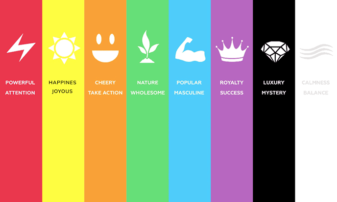
🟥 Red – Stimulates, excites, and triggers impulsive purchases. Associated with energy and passion.
Use case: Ideal for weight loss products and energy boosters.
Example: Fat burners with red and orange accents intensify the sense of «heat» and faster metabolism.
🟦 Blue – Evokes trust, calmness, and is strongly associated with medicine.
Use case: Perfect for heart, vision, and joint health supplements.
Example: Heart health supplements in blue tones feel like reliable medical products.
🟩 Green – Associated with naturalness, health, and safety.
Use case: Effective for plant-based supplements and anti-aging creams.
Example: Skin rejuvenation creams with green and gold elements give a strong sense of «natural care».
🟨 Yellow – Grabs attention, linked with positivity, warmth, and energy.
Use case: Good for general wellness supplements, especially vitamins.
Example: Yellow accents on immunity boosters reinforce the idea of energy and vitality.
⬜️ White – Represents purity, minimalism, and medical safety.
Use case: Fits premium nutra-products and medical-grade supplements.
Example: Prostate treatment packaging in white and blue tones builds trust.
🟪 Purple – Symbolizes luxury, mystery, and strength.
Use case: Perfect for anti-aging creams and high-end products.
Example: Purple and gold packaging creates a premium and exclusive impression.

How packaging colors influence consumer behavior in specific markets:
🇵🇭 Philippines:
Buyers trust blue and white packaging due to its medical and safe appearance.
Bright colors like red, yellow, and orange work well for weight loss and metabolism products.
Natural products are expected to have green or earthy brown tones.
🇵🇪 Peru:
Earth tones (brown, green, gold) convey organic quality and safety.
Dark shades (deep red, navy blue) are associated with premium products.
Women respond positively to purple and pink for anti-aging products.
🇬🇭 Ghana:
Consumers are familiar with vibrant colors — yellow, red, green.
White suggests cleanliness but full-white packaging may look overly clinical.
Red and yellow shades help boost interest in weight loss products.
🇲🇦 Morocco:
Gold, purple, and navy blue are associated with luxury and effectiveness.
Green is seen as healthy and organic.
Consumers prefer packaging inspired by oriental design aesthetics (patterns, traditional elements).
Extra packaging elements that boost sales:
✔️ Pharmaceutical-style design – The more it looks like a medical product, the higher the trust.
✔️ Matte finish – Creates a sense of premium quality.
✔️ Gold foil embossing – Works well for high-end nutra-products.
✔️ Minimal text – Clean design improves readability and trust.
📊 Stats & Research:
– 52% of consumers choose supplements that visually resemble pharmaceutical products.
– 73% prefer natural color schemes (green, brown) for organic supplements.
– 81% of women trust anti-aging products that use purple and gold in their packaging.
✅ Conclusion:
For nutra brands entering markets like the Philippines, Peru, Ghana, and Morocco, adapting packaging design to local color preferences is crucial.
The right color choices, pharmaceutical aesthetics, and premium touches boost sales and build brand trust.
Want more useful insights? 👉 Join our channel!
Or maybe you want to level up your skills? Then come to our free aff1 Academy — we’ve got you covered.


Добавить комментарий